
How “Color of the Year” has moved from Pantone to paint
For the second year in a row, Dunn Edwards is selling a different kind of paint: nail polish.
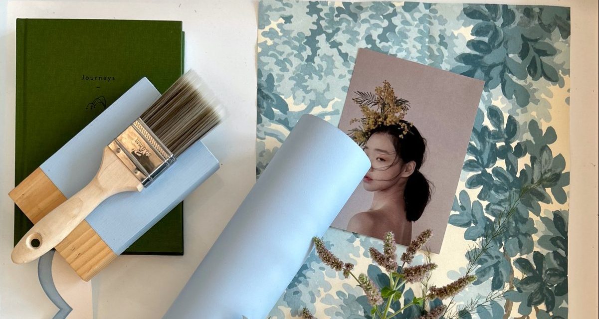
Available in its 2024 Color of the Year, a calming blue hue called Skipping Stones, the polish will be sold exclusively on its website and used in branded giveaways. It’s one of several ways that Dunn-Edwards uses its Color of the Year as an ongoing marketing campaign.
“People love the color of the years and they love the storytelling behind how they’re picked,” Lisa Kudukis, vice president of marketing and innovation at Dunn Edwards, said. “Of course we want to sell paint, but we want people to feel like part of the campaigns — and this is a way they can get it, explore it and be inspired.”
Color of the Year campaigns date back more than two decades when the Pantone Color Institute began its annual selection in 1999. As a global research organization that studies the use and science of color, Pantone’s choice aims to reflect the broader culture, selected by analysts who are studying entertainment, fashion, art, travel and technology. 2023’s Viva Magenta, for example, is a vibrant crimson hue that pops in physical and digital realms. But the trend accelerated beyond the world of design and into the zeitgeist when Pantone began merchandising its color. Pantone previously partnered with the likes of Sephora and Lenovo on limited-edition products. The 2024 choice and associated partnerships will be revealed Dec. 7.
But Pantone isn’t the only color of the year player anymore. In the last few years, paint and design companies have gone all-in on the trend by selecting their own color of the year from their collections, and event putting out associated palettes. Since 2015, Sherwin-Williams has picked an overall color of the year and also has dabbled in monthly selection. Behr started announcing an annual color in 2017, while Benjamin Moore since 2005 has selected a main color and several coordinating tones. Dunn-Edwards, a nearly century-old company founded in Los Angeles that’s now owned by the Japan-based Nippon Paint Holdings, stared offering its annual choice in 2017. C2, a 25-year-old brand that sold independent stores until it launched its e-commerce site in 2023, is newer to the trend.
Dunn Edwards “jumped on the bandwagon” when it seemed that every paint brand was getting into the trend, Kudukis said. The chosen color typically sees a double-digit sales boost, and often is one of the most popular color choices that isn’t a traditional white or neutral, Kudukis said.
While it’s not a game-changer from a revenue standpoint, Kudukis said it’s an important engagement tool for customers. The nail polish is the most popular giveaway at trade shows, she said, with “lines out the door,” and it sold out online in 2023’s shade, an earthy pink called Terra Rosa. The color choice also provides fodder for social and marketing campaigns. This year, the Skipping Stones campaign has dreamy underwater images that incorporate its greenish-grey blue.
“Sometimes the color of year is something that everyone could use in a room,” Kudukis said. “Skipping Stones fills that niche, it’s a very useful color.”
Beyond paint, Dunn-Edwards dabbles in merch and brand collaborations. Last year, the brand opened up a store on its site where it sells items from other brands that come in Skipping Stones or similar shades. Rather than being made specifically for Dunn Edwards, the items are sold wholesale through the paint company from boutique brands, like a bud vase from Texas-based pottery company Modernly Planted, an ESW Beauty sheet mask or Pinecone Trading Co.’s bandana. It also partnered with San Diego-based artist, Sarah Stieber, to use Skipping Stones on custom earrings.
Kudukis said merch sales are negligible from a revenue standpoint but it helps shoppers sample the color and think about how to use it in their home.
“It’s not going to change the trajectory of our company. But again, that’s not the reason we come up with it. It is a conversation starter,” Kudukis said.
Other paint companies have started doing it too. Philippa Radon, an interior designer and paint color specialist for C2, helped select her brand’s color of the year, which this year is a bright blue called Thermal. Radon said selecting the color comes down to looking at what’s going on with design all over the world and finding common threads, like what’s showing up on fabric prints and wallpaper.
“We look at the fashion world, the interior design world, cosmetics, textiles, and it’s just an accumulation of different information,” she said. “A general sort of mood of what people are looking for and feeling.”
C2 went with Thermal this year because if its bright and uplifting tone. Radon said not everyone is looking for a major change, and a subtle choice like Thermal makes for a good choice for a refresh on an accent wall, ceiling or cabinet. Next year, the brand hopes to collaborate with furniture designers on special items in the chosen color, Radon said, however those conversations are ongoing.
For designers, the word “trend” can give them “the slight heebie-jeebies” Radon said, as few want to follow the pack. But colors of the year help give inspiration without telling people how to design their homes, Radon said.
“We all have our own personal palette. Colors that resonate for us and don’t for somebody else. And it’s a very sensitive, emotional part of the design world,” she said. “You really need to see what notes resonate and hit right for you first.”